
Role: Lead Designer
Role: Lead Designer
Role: Lead Designer
Mobile User Data Sync Indicator
Mobile User Data Sync Indicator
Mobile User Data Sync Indicator
Date: Launched Q1 2025
Date: Launched Q1 2025
Date: Launched Q1 2025
Sync Indicator
Sync Indicator
Sync Indicator


Problem
Problem
Problem
Problem
During a site walk, we heard consistent frustration: users couldn’t tell if their mobile data had synced, and sometimes lost work in offline mode. For maintenance teams working in buildings with poor signal, this was a major trust issue.
During a site walk, we heard consistent frustration: users couldn’t tell if their mobile data had synced, and sometimes lost work in offline mode. For maintenance teams working in buildings with poor signal, this was a major trust issue.
During a site walk, we heard consistent frustration: users couldn’t tell if their mobile data had synced, and sometimes lost work in offline mode. For maintenance teams working in buildings with poor signal, this was a major trust issue.
Goal
Goal
Goal
Goal
Design a clear, unobtrusive indicator to show sync status in real time, so users knew whether their data was safe, syncing, or stuck.
Design a clear, unobtrusive indicator to show sync status in real time, so users knew whether their data was safe, syncing, or stuck.
Design a clear, unobtrusive indicator to show sync status in real time, so users knew whether their data was safe, syncing, or stuck.
Impact
Impact
Impact
Impact
The Sync Indicator gave users confidence in their actions, even when connectivity dropped at their properties. It turned an invisible pain point into an understandable, actionable part of the interface.
The Sync Indicator gave users confidence in their actions, even when connectivity dropped at their properties. It turned an invisible pain point into an understandable, actionable part of the interface.
The Sync Indicator gave users confidence in their actions, even when connectivity dropped at their properties. It turned an invisible pain point into an understandable, actionable part of the interface.

Project Summary
Project Summary
Project Summary


Site Walk Discovery
Site Walk Discovery
Site Walk Discovery
Site Walk Discovery
"I never know if my data saved or if I have to redo everything". This wasn’t something that surfaced in usability testing, it came directly from being on-site with users in real conditions. That feedback drove the core idea behind this feature.
SyncIndicator.png
SyncIndicator.png
SyncIndicator.png
SyncIndicator.png
Navigation Integration
Navigation Integration
Navigation Integration
Navigation Integration
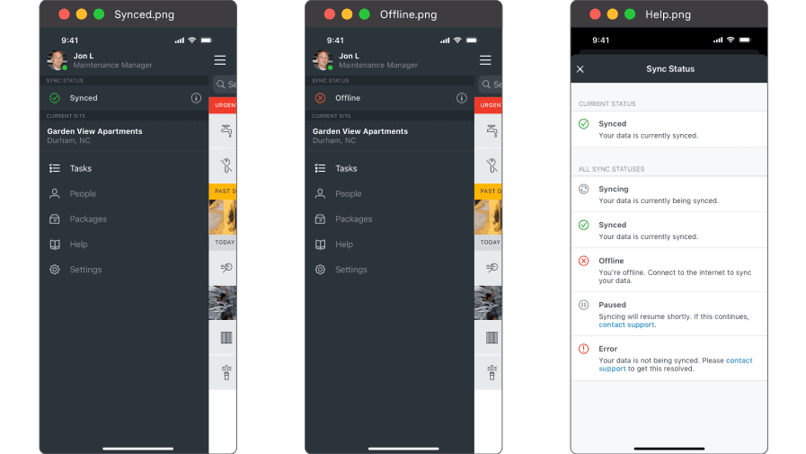
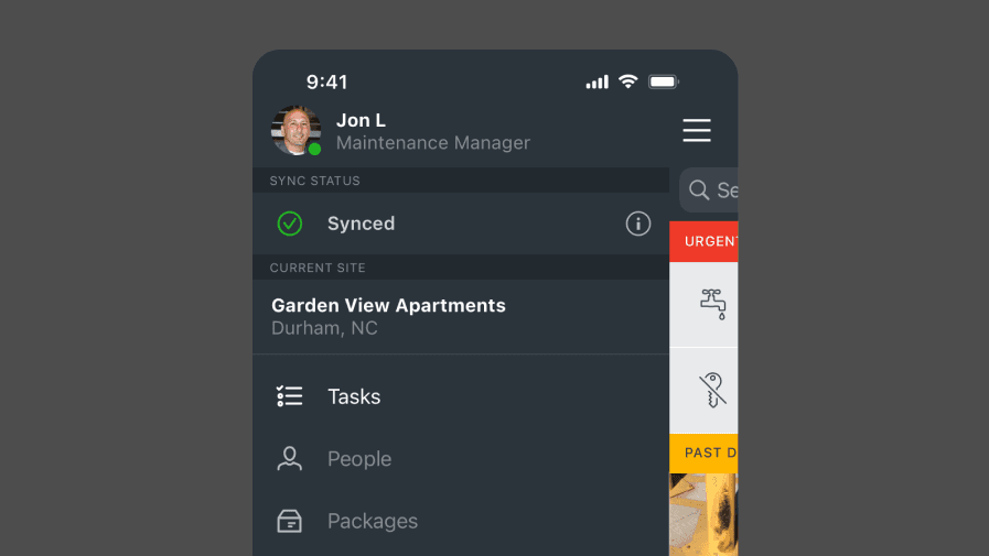
I placed the sync status in the top navigation bar where users naturally look, using simple icons and color states to indicate real-time status without taking up extra screen space. It was important for this indicator to be above sites to indicate it was for all data.
I placed the sync status in the top navigation bar where users naturally look, using simple icons and color states to indicate real-time status without taking up extra screen space. It was important for this indicator to be above sites to indicate it was for all data.
I placed the sync status in the top navigation bar where users naturally look, using simple icons and color states to indicate real-time status without taking up extra screen space. It was important for this indicator to be above sites to indicate it was for all data.
SyncHelp.png

SyncHelp.png
SyncHelp.png
SyncHelp.png
Help Screen for Sync States
Help Screen for Sync States
Help Screen for Sync States
Help Screen for Sync States
I also designed a reference screen users could open to understand what each icon and status meant, especially important for getting users quick help and reducing panic when sync failed.
I also designed a reference screen users could open to understand what each icon and status meant, especially important for getting users quick help and reducing panic when sync failed.
I also designed a reference screen users could open to understand what each icon and status meant, especially important for getting users quick help and reducing panic when sync failed.
Results
Results
Results
Results
Created clarity around an invisible process (syncing), aligned with engineering to ensure real-time feedback matched actual app behavior, designed for minimal UI interruption on a mobile-first platform.
Reflection
Reflection
Reflection
Reflection
This was one of the most user-empathetic features I’ve worked on despite being relatively small. It reminded me how much insight comes from being close to users, not just analyzing metrics or mockup feedback. A small UI change made a huge impact on trust, and it deepened my commitment to designing for real-world conditions.
This was one of the most user-empathetic features I’ve worked on despite being relatively small. It reminded me how much insight comes from being close to users, not just analyzing metrics or mockup feedback. A small UI change made a huge impact on trust, and it deepened my commitment to designing for real-world conditions.
This was one of the most user-empathetic features I’ve worked on despite being relatively small. It reminded me how much insight comes from being close to users, not just analyzing metrics or mockup feedback. A small UI change made a huge impact on trust, and it deepened my commitment to designing for real-world conditions.
Contact Me!
Contact Me!
Want to work together? Let’s talk before I pick up another side project.
Want to work together? Let’s talk before I pick up another side project.
Want to work together? Let’s talk before I pick up another side project.
Reach out via one of these methods.
Reach out via one of these methods.
Reach out via one of these methods.
